How Effective is the combination of your main product and ancillary texts?
When we were creating our media product, discussing our branding and ancillary texts we wanted to make sure there was a main theme throughout all of our work. In order to make products successful, there needs to be an element of something significant. This then allows the audience to have a lasting memory about the product as well as allowing it to stand out from other products and competitors. If done correctly the iconic image can become known and attracted to the company - symbolic or iconic imagery. This then can lead to further popularity of the film; this can then add more revenue to the final production income.choosing the significant part of the film is important and could be anything from a prop to a location, the logo/font or even a persona of person.
For our poster we chose to use an iconic image of the main character. We took inspiration from famous posters that used people as their main and iconic focus.
Iconic Imagery
|
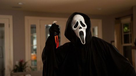
Iconic imagery can help a company be remembered years after the film was made, released or in cinemas. One of the most iconic pieces of imagery within the film industry to date is the mask from Scream which was released in 1996. Due to the popularity and symbolism of the mask, the company used this iconic image to promote their other films. The mask has become known as one of the most recognisable pieces of imagery within the franchise.
|
Iconic Text and Font
|
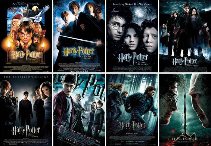
Films use an iconic text and font in order to make their films represent a brand and/or company. By doing so, a film like Harry Potter can be easily seen and recognised as a collective brand - even after multiple films are released. A way of making the text iconic is to use a key feature of the film, the main characters name, a location of where its based or the name of an iconic symbol that is present within the film. The colour choices can sometimes vary however the font and style stay the same in order to keep the brand style.
|
|
Iconic Posters and Inspiration
|
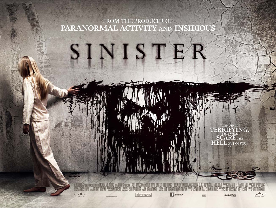
SINISTER - released in 2013
The poster for Sinister is memorable and significant due to the girl revealing a face within the blood trail that she leaves behind her. This form of iconic image hints towards the films genre choice. The cracked walls and face reveal to the audience that the film is dark, twisted and hints towards an isolating environment. From the film, we know that this is the atmosphere that is laid out through out the storyline due to Mr Bogey coming to get the children and 'removing' them from their families through death. bis face is never seen so the hint towards his face being revealed within the blood shows what kind of character he truly is. Although never seen - the face is hinted to be the main character of the film within the poster due to its positioning within the frame. |
|
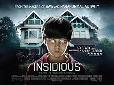
INSIDIOUS - released in 2011
This is one of the most recognisable posters that has been produced; this is due to the iconic boy that is pictured on the front. The poster shows a possessed boy in front of a dodgy looking house, this iconic image is left as a symbol for this film. The caption linked to the poster adds to the overall effect of the film and build up of the image - " It's not the house that is haunted". This quote on the front of the poster allows the audience to interpret that it is the boy who is the evil, not the surrounding as it so for seems as laid out by the dark surroundings. It shows that the possessed child has the power and control over his family. The font which is present is simple and basic. This is a trend in horror films. |
|
|
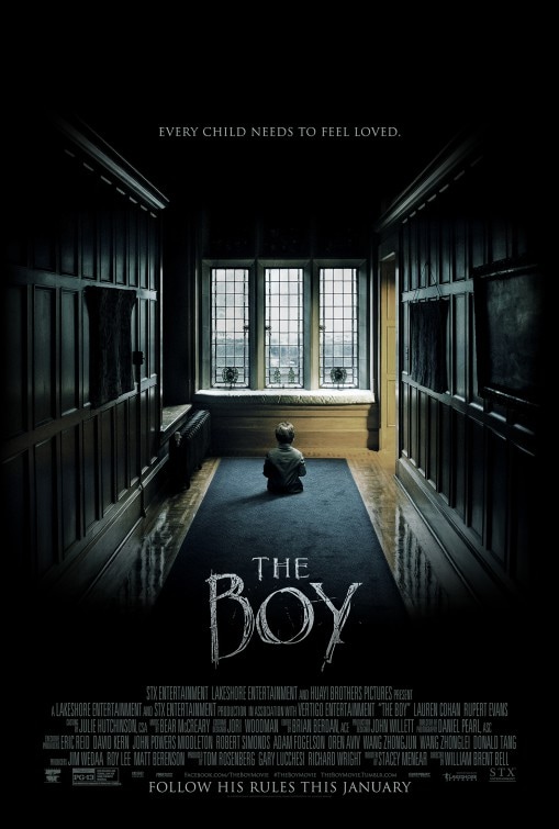
The Boy - released in 2016
This poster uses leading lines and the rule of third theory within photography in order to draw the audience to a singular object of importance within the middle of the poster. The use of dark and light draws attention to the small child sat in front of the window. The cliche of dark colours and the window reflecting open space represents hope, however the darkness shows the boy is trapped. This poster is iconic due to the positioning of the text and the chosen font. The lettering draws the audience to the poster and the title represented lettering that was engraved/scratched into a surface. The tag line of the film, every child needs to be loved, adds to the suspense and build up of the film. Instead of just saying out this January, the use of changing the format its normally presented in adds to the overall affect of the poster and film - Follow his rules this January. |
Final Poster
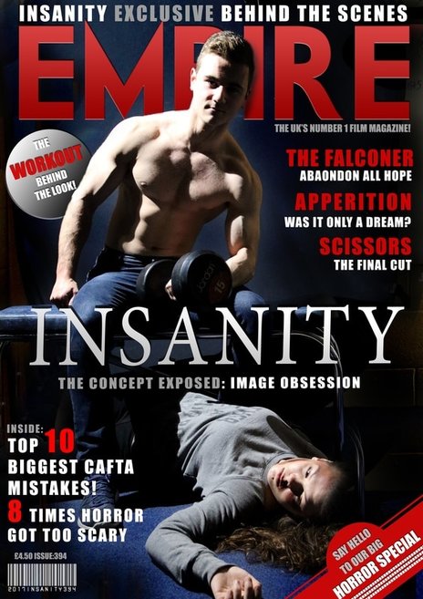
Our poster we decided to use 1 singular iconic image and copy the same style and format of traditional posters. We did this to draw the audience into the poster; the iconic image is representational of the film without giving too much away. The knife is subtle hint towards the direction of the film, a body obsession turning into psychopathic killing spree. From the original image, to our final poster, we had to edit the image to fit the theme of our trailer. Using the same red mist that is present within the trailer, we layered the smoke over the main character in order to connote the horror theme by adding depth to the poster. Our original image is simplistic. This is due to simplistic pictures producing the best results by less becoming more. The image was taken by positioning the main character in front of a black screen and shining a light on him to bring fourth light and dark shadowing. This allowed for the main character to be highlighted against the background and be naturally lit in a mysterious but intriguing way before enhancement within post-production. We chose to have Adam (the main character) in this position as you cannot see his face clearly and only his body. This emulates the trailer. When developing the poster, we decided the simplistic look was best for effectivity and for the aesthetics of the poster. We decided to keep the text basic and position that within the empty spaces of the image. We decided to not deviate too much away from the original image, instead with a few brightness and shadow enhancements (using photopshop) we stayed close to our taken image.
Magazine Process
|
|
On the left was our first image for our Magazine cover. We decided against using this image as we felt it did not follow the theme of horror enough as well as did not fit the overall idea behind our media. Through trail and error we planned the image we used through images that did not grasp the full concept of our trailer. We decided that the initial image was a starting point and it lead to us creating our final piece. The final image came from us looking closer at our trailer and the type of shots we used and the storyline it portrayed. Adding the victim and weight equipment, we decided, was crucial to telling the story of the trailer as well as adding the best possible look for the magazine cover. using special effects make-up, the victim is shown as bruised and beaten in contrast to the main character who looks ripped and lit by bright lighting to show his power.
