
In What way does your media product use, develop or challenge forms and conventions of real media product?
|
Using Conventions
|
|
Developing Conventions
|
|
Changing Conventions
|
Poster
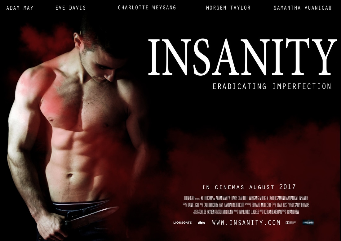
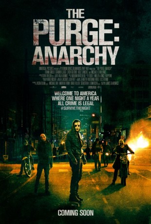
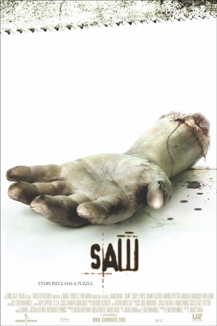
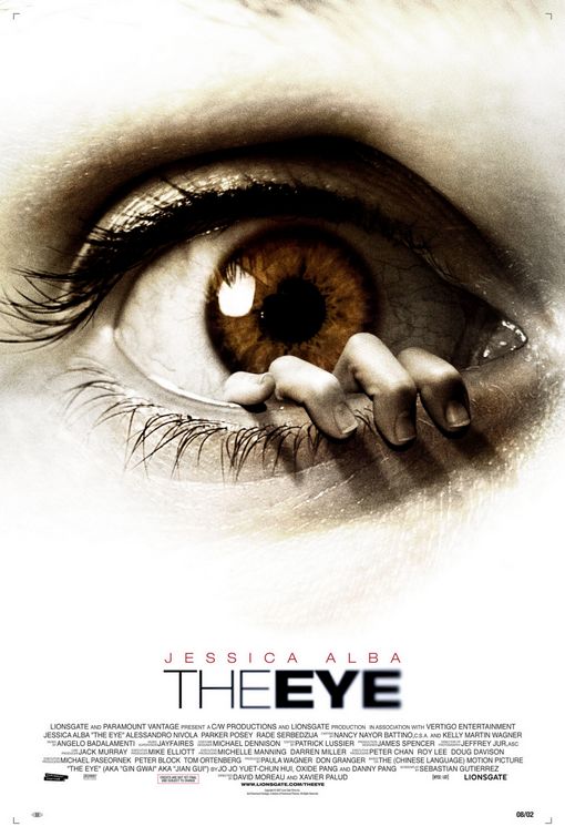
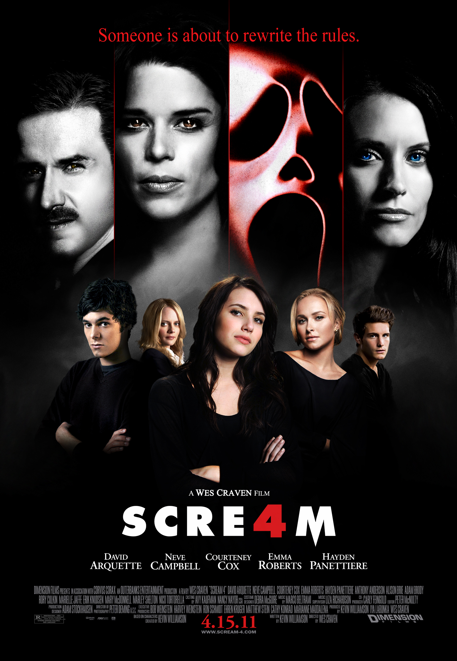
When creating our poster , we decided to use a dark colour scheme to make the poster using a red and black colour scheme, to give our poster a more sinister look. We chose avoid using a brighter colour scheme to give a different message of the character being mysterious instead of innocent. Many poster have done both ideas to show a sinister look and innocent look. For instance "Purge" and "Scream" used a darker colour scheme where as "The Eye" and "Saw" used a brighter colour scheme. We decided to use a darker colour scheme because we felt the use of the darker colour would give a better effect for the killer on the poster than a lighter colour scheme. But the darker colour scheme links well to our poster with a red, black and white colour scheme which represented clearer our trailer with the correct colours and sinister look. The red text links to the conventions of horror which represents blood and gore within the movie.
|
|
|
|
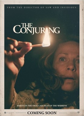
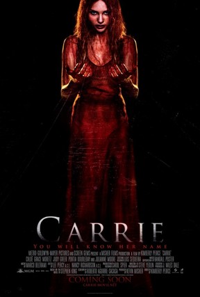
Our image on our poster, we decided to use a main picture of the colour on the poster to represent the theme of body image in the trailer. We wanted to oppose the horror conventions with the use of male killer as a victim as well as the killer. Due to the only victim being the final girl which links to Clover's final girl theory. We wanted to step away from this and use the killer as the main character on the poster to show killer who was not going to be stopped from killing his victims. Although it is common to use the focal point for a victim which links to the media conventions, we decided to use the killer for the main focal point due to a pictures of the killer also being very popular in horror trailer poster. Examples of horror posters that we looked at for our Poster inspiration were "Carrie" who was a main victim in the horror film and "The Conjuring" where the poster shows the main victim.
|
|
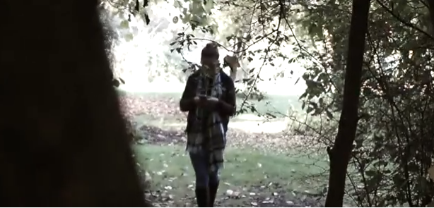
We decided for the background of our poster we wanted to take a different picture from the trailer instead of using a still picture from the trailer. We decided to take a picture in the gym where the trailer is originally set. We tried to advertise to both our male and female audience this was do with using out main male actor as the killer for the movie poster and magazine cover uses a male and female actor/actress. Most movie posters try to please both target audiences but this is difficult to do so most famous movies only use a female victim to appeal to on target audience. This links to the conventions with horror always showing a female victim as weak in horror.
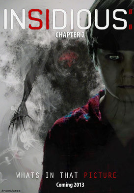
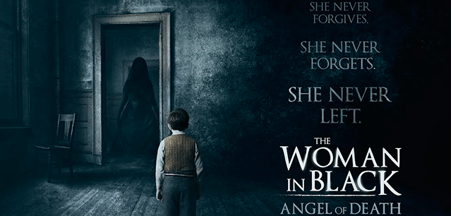
We also decided that we would follow the horror poster conventions by placing the actors and actresses names at the top of the poster to show who starred in the movie trailer starting with the first actor/ actress that appears. Also using credits at the bottom of the poster to say what roles people had who were involved with the trailer. We also placed the main title using a white colour for the font to make the writing stand out in the black background. Also placing the tagline just underneath the title and the picture of the killer slightly to the left. An example of another horror poster that used the picture away from the center was "Insidious" and "The Woman In Black"
We also decided that we would follow the horror poster conventions by placing the actors and actresses names at the top of the poster to show who starred in the movie trailer starting with the first actor/ actress that appears. Also using credits at the bottom of the poster to say what roles people had who were involved with the trailer. We also placed the main title using a white colour for the font to make the writing stand out in the black background. Also placing the tagline just underneath the title and the picture of the killer slightly to the left. An example of another horror poster that used the picture away from the center was "Insidious" and "The Woman In Black"
|
|
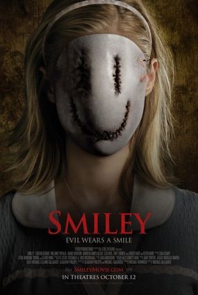
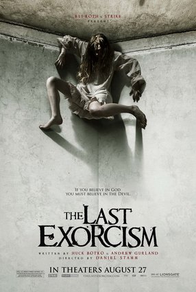
We decided to use the same tagline we used in the trailer for the poster,"Eradicating Imperfection" and we placed this just below the title, "Insanity". We wanted to show the tagline on the poster because it relates to the horror convention of having the tagline always on the poster. But many posters are different depending on the design most posters pick. But most movie posters only consist of two or three words for the tagline. Examples of some posters tag lines are "Smiley" which has "Evil wears a smile" and "The Last Exorcism", "If you believe in God you must believe in the Devil".
|
|
Poster font we used for our Poster which was a very simple and clear font. But we decided not to over complicate the trailer font for the poster because we felt if we used a too complicated font and size of the text it would have been too over powering on the page and look too complicated. We took inspiration from "Insidious" and "Sinister" due to the darker colours on a poster convincing us that we need to use darker colour scheme to make the movie poster compare to the conventions of other horror posters.
Magazine Cover
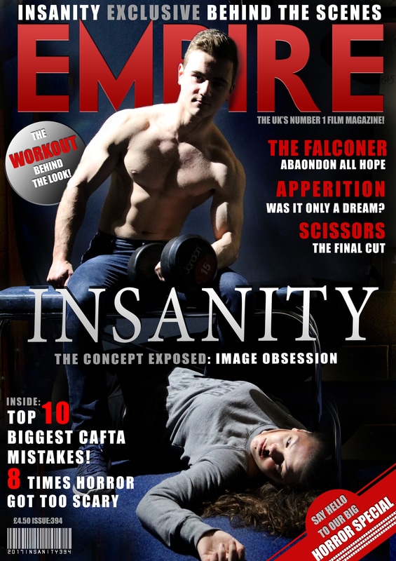
The magazine cover links to the conventions of horror due to the image of the killer looking straight at the camera and directly at the target audience. A lot of magazine posters prefer to have the killer and a victim on the poster because it adheres to the conventions of horror with the victim being a girl who is weak which relates to Clovers theory which is final girl theory. Then we use a male killer who is shown as strong and higher power than the victim which relates to the stereotype of gender in horror. We used both genders because it appeals to our target audience which we tried to expand to both genders so they will watch the movie. We tried to go against the conventions and stereotypes of horror with female victims being blonde. To change this we used a brunette victim so we could move away from victims in horror only being blonde.
Colour scheme for our magazine was white, red and black which links to the stereotypes of horror always using this colour scheme of black and red. We tried to move away from using the same colour scheme every magazine uses. We used white and grey in text to add independent magazine that is different from the rest of magazines already published for horror movies.
Tagline on the magazine was "The concept exposed : Image Obsession" which instantly tells the target audience what the trailer is about and also tells you the effect we tried to address the magazine about. We did this in grey and white colours to go against the horror conventions but our overall idea is completely against the original idea of body obsession which is not really seen in horror. Also the font throughout all of the magazine is bold to make the magazine standout to the target audience but this is also used in other magazine covers with a mixture italics and non bold text. But we went against this convention and only used bold text on the overall horror magazine.
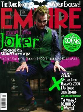
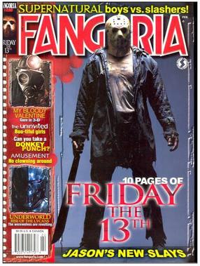
The layout for the overall horror magazine used a mixture of different sized text to make the magazine cover different and stand out. We also used a barcode in the bottom left corner and label on the bottom right corner. This gives our magazine cover a unique look in comparison to other magazine covers which show different pictures of other films that they are associated with. We tried to avoid this by using only the title of the films instead of pictures which are normally included as well. Examples of inspirational magazine poster where Empire and Fangoria.
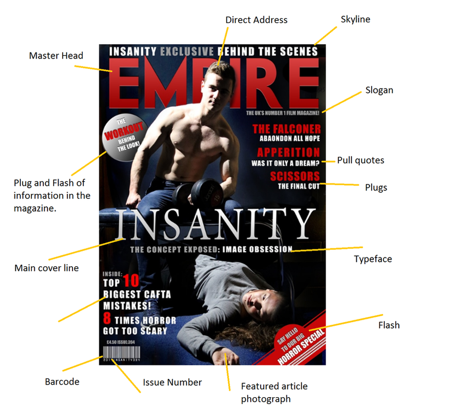
Annotated Magazine Cover
|
|
