Movie Poster Analysis
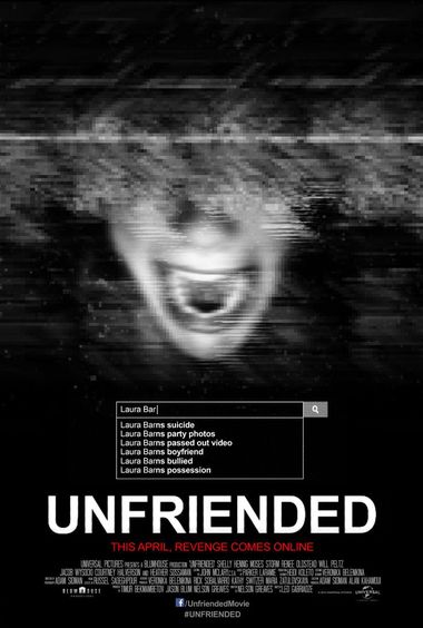
This Unfriended poster follows horror poster convention because they have chosen to use a dark and ominous colour scheme. The face is also in black and white whilst implementing static over their screaming face which definitely expresses the fear that the film is trying to portray. The date of release is also highlighted in its own unique red colour. This was a good use of colour as red is stereotypically known to represent blood, gore and violence.
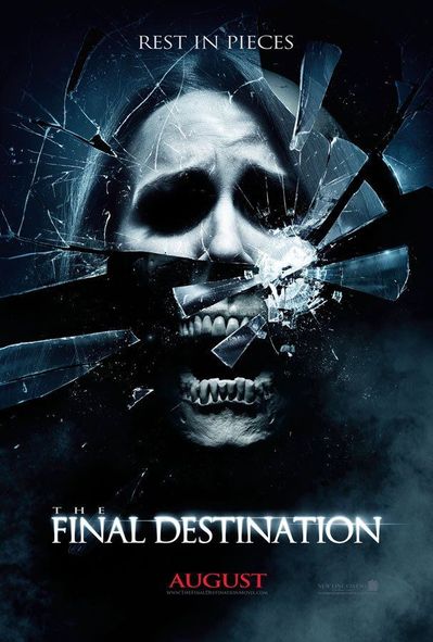
Final Destination follows a similar convention to Unfriended because it too uses a dark black and white colour scheme. The main title is also in white which stands prominent on the black background because of the heavy contrast. They have also used red text to explain its release date whilst also expressing its gory and bloody nature through the use of sterotypical colour choices.
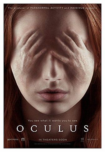
The Oculus film poster follows similar film conventions to the other two in that all of the posters have chosen to all base their posters of a close up of a face. All of the faces are also faces of the victims that have suffered throughout the film. However this poster differs in that the poster is printed in colour. The coloured face portrays different connotations as it is rather bright as opposed to the stereotypical black and white theme. The title is also printed in white and placed at the lower half of the page.
The Grudge
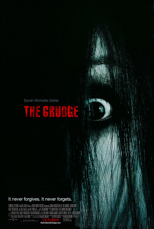
The Grudge poster follows similar film conventions to the other two in that all of the posters have chosen to all base their posters of a close up of a face. This the poster shows the stereotype black and white poster as well as using red in the title show the blood and gore that will be included in the film. The title is slightly covered with black in the colour to show that the hair is slightly covering the title. To contrast the picture and the title.
Saw
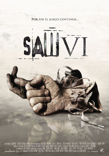
The poster for Saw does not really follow horror conventions. But it does use a bit of black so it does follow some of the conventions. The poster represents to gore factor of the movie and links to the movie with people cutting off limbs and doing things to other people to survive. The image is representing the pattern of the film and is juxtaposing a clean room and dirty things to show the victim being the one who has done wrong. And showing the killer as the person with doing the justice and making it look like him doing the right thing by punishing these people.
Sinister
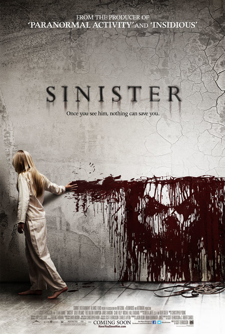
In the poster for sinister the child is dragging red ink along the decaying wall which represents the devil almost. Always being there and everything is ageing around him and he will never disappear. The colour of the white in the picture is representing the loss of innocence and using the young child also represents it as well. Blood is also used to represent alot of death in the overall poster.
Our Poster Inspiration

Our poster inspiration will be mostly from American Horror stories as it shows the smile aspect of The Devils Grin we plan on doing in the overall poster. Only to show the smile and nothing else in the shot to build tension and using overall black in the background and red to instantly tell the audience that this is a horror and the person is the killer.