Our starting point was just of our main character positioned to the left of a black background. We developed this with our trailer theme un mind to incorporate a red mist - linking in with our title slides within our trailer.
|
|
Developments:
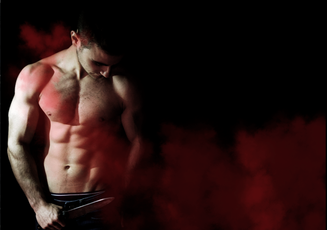
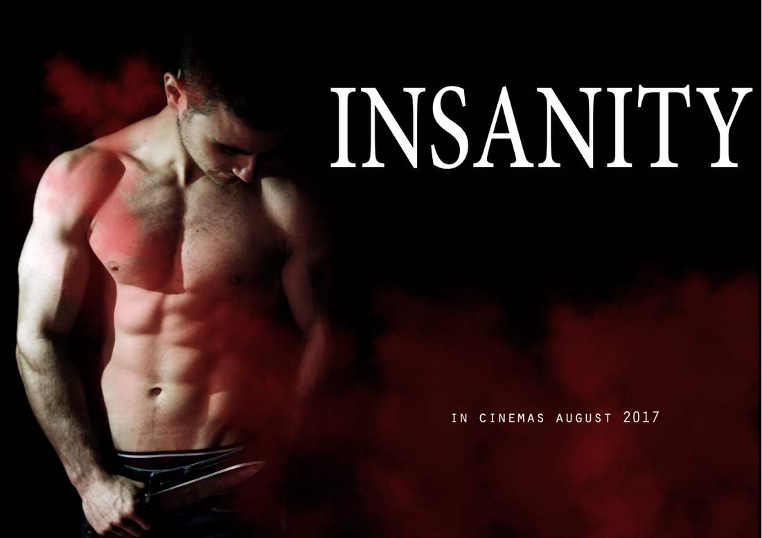
The image on the left was taken against a black wall. Within Photoshop we added the same red smoke effect you see throughout the trailer as a separate over-laying layer. We then began to look at the key concepts within a poster and what was needed within the media its self. Through adding separate layers, we began to add text onto the poster. Selecting the correct font is crucial to the overall look and effect of the final product. We chose to use the same font we did within the trailer for the title to show consistency. The other text present needed to have a different font in order to distinguish the title from the rest of the information present. Through trial and error, getting the sizing of the text correct and in proportion to the surrounding elements took a few attempts; varying from too big, to too small very easily.
The image on the left was taken against a black wall. Within Photoshop we added the same red smoke effect you see throughout the trailer as a separate over-laying layer. We then began to look at the key concepts within a poster and what was needed within the media its self. Through adding separate layers, we began to add text onto the poster. Selecting the correct font is crucial to the overall look and effect of the final product. We chose to use the same font we did within the trailer for the title to show consistency. The other text present needed to have a different font in order to distinguish the title from the rest of the information present. Through trial and error, getting the sizing of the text correct and in proportion to the surrounding elements took a few attempts; varying from too big, to too small very easily.
|

|
Developments:
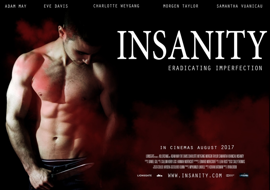
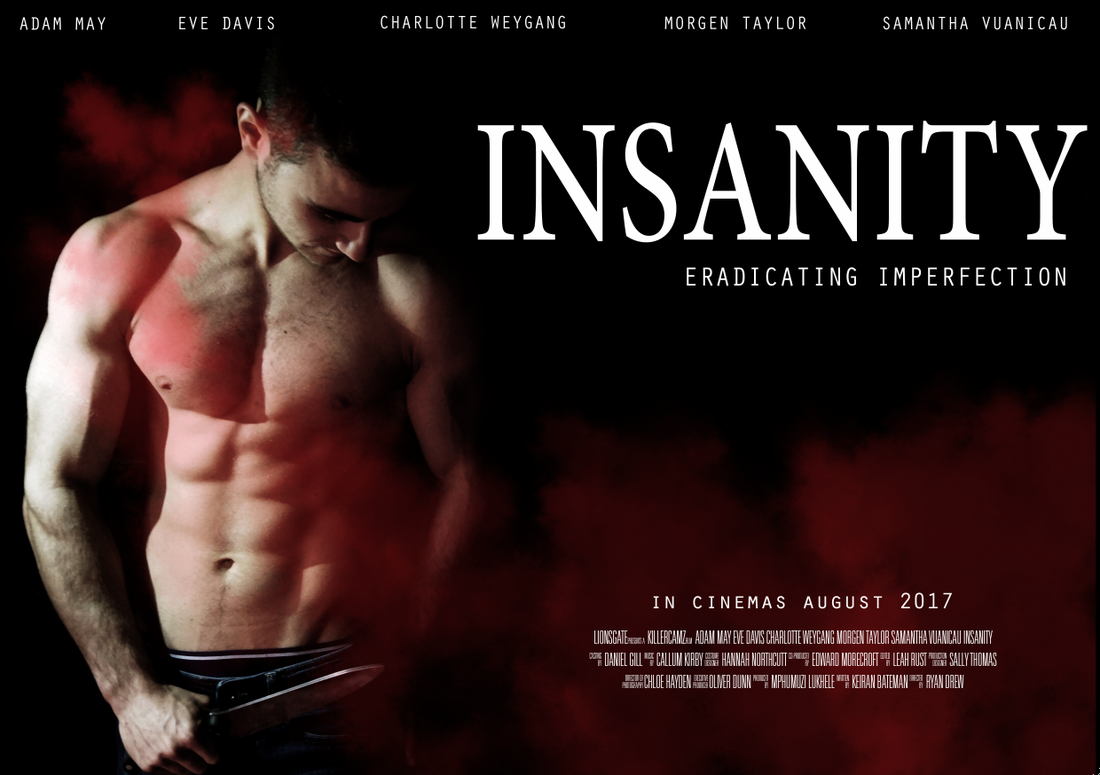
Through more individual layers on Photoshop we were able to add the key pieces of information which included information such as release dates, actors, directors, costume designers etc. Using the internet we were able to find a guide to constructing a poster for the film industry which allowed us to see the order in which names should appear on the poster (as seen below the release date on the above image). Once all the text was added, we then added supporting logos next to the website for the film. This then meant that all the necessities required to be on the poster were added and we were able to just gently tweak the placements of some text. Once we were happy with the placement of the various layers of text, the image below shows the final product.
Through more individual layers on Photoshop we were able to add the key pieces of information which included information such as release dates, actors, directors, costume designers etc. Using the internet we were able to find a guide to constructing a poster for the film industry which allowed us to see the order in which names should appear on the poster (as seen below the release date on the above image). Once all the text was added, we then added supporting logos next to the website for the film. This then meant that all the necessities required to be on the poster were added and we were able to just gently tweak the placements of some text. Once we were happy with the placement of the various layers of text, the image below shows the final product.
Our final product consisted of various layers of text and imagery. The image itself remained simple with the smoke from the trailer added to tie the two products together. The video below shows a screencast of the various layers which come together to form the final image.