Magazine Cover
In a magazine cover there are several different conventions which appear in a magazine. There is a bold title to attract audiences and bring attention to the magazine straight away. The main title needs to attract the target audience to the magazine straight away with different fonts and colours. There is a large image that will be positioned in the centre of the magazine and they tend to be the main character or celebrity in a film, band or programme; which makes the main feature stand out to the target audience to attract them.
There is also a colour scheme involved in the magazine constantly throughout to link the colours back the main feature. There is smaller text and images around the outside of the magazine cover to give the audience an idea as to what content is also in the rest of the magazine. But it does not give too much attention away from the main feature.
The Empire Magazine is an example of a magazine cover that always has it main title behind the main feature. So it still advertises the feature and attract the target audience. The most likely colours they will use for more action films and horror movies will be red and white that will be shown throughout the rest of the magazine as a colour scheme. They also use different sized fonts to make the text stand out but also look different to the rest of the magazine and link to the main image.
|
|
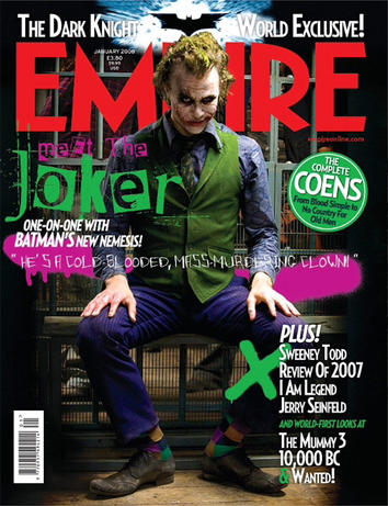
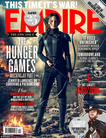
The Empire magazine advertising the Filming with joker with the main colour scheme being green,red and white. The green links back to the main image with the costume being green and the red and white linking back to the face makeup. They have use different fonts and use most of the advertising for the rest of the features on the right hand side. The Empire magazine advertising The Hunger Games with Jennifer Lawrence the colour scheme links to the costume she is wearing and fonts being slightly different to make them stand out to represent an action genre. The magazine also has the title in the background so the main image is still advertised. They also have used the advertised content on both sides of the magazine.
|
|
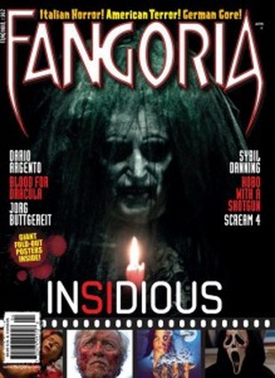
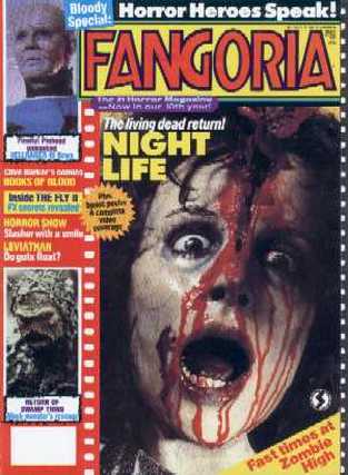
The first Fangoria magazine cover focusses on very dark and creepy colour schemes. For example the poster has chosen a white, black and red colour scheme which matches to the main films scary features. the text is in white due to the ghostly pale face. They have also added the odd red text amongst the white which draws attention to the red candle that the ghost is holding. This is effective due to the fact that we would find out that the red candle plays a significant role in the actual film with this specific spirit. The second cover focuses on a yellow and red colour scheme which may have been used to draw a lot of attention to their target audience. This was effective because the red colour matches to the gory mess that is featured in the centre. the yellow areas around the title were also effective due to the fact that it contrasts very well with the red of the text. This ultimately doesnt really relate to the image however, due to the contrast, its made to be just that little bit more eye catching when compared to other horror oriented magazine convers.
|
|
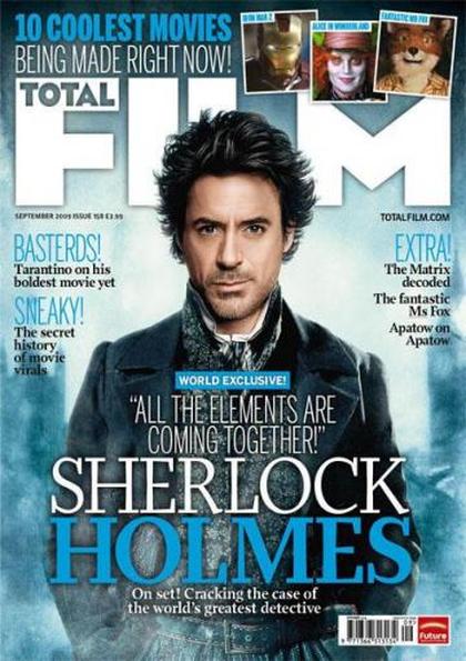
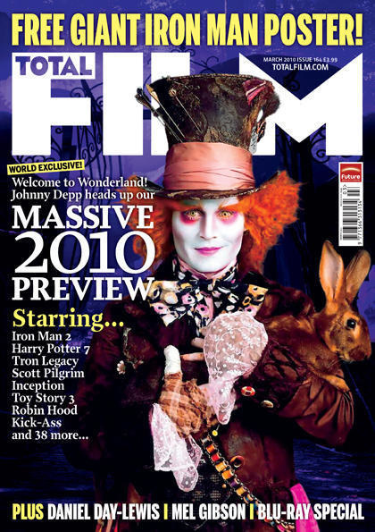
Total Film Magazine uses the colours all over in the first magazine with Sherlock Holmes. The overall colour scheme shows a positive outlook on the magazine with the pictures of the rest of the features being at the top and the writing being around the outside. It does not draw too much attention away from the overall image. The title is hidden behind the main character so it does not get in the way of the main feature. Total Film represented the overall colour scheme to represent Johnny Depp as the mad hatter. Using colours from his costume to link back to the main feature and overall cover represents the other features as well using different fonts and colours. Some of the words do over lap the main feature and draws attention away from Johnny Depp.
|
|
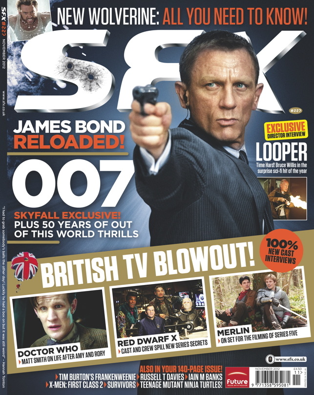
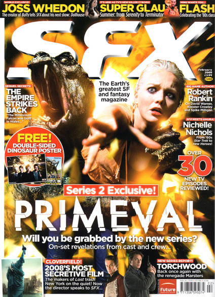
The SFX magazine cover on the left has a rather bluish steel look to it which follows closely to the suit that 007's well known style and what he is wearing. they have also chosen the titles to be made white with silvery accents which also conforms to 007's style. For example 007 is well known for driving silvery metallic aston martin's. The gold also makes the character appear more professional and regal which has portrayed exactly how the film was intending to portray the new bond. The cover on the right also chose a white title colour scheme which matches her hair colour. it also matches the colour scheme used on the Primeevil's official title too. this was effective because it allows people to visualise the show from the magazine as the magazine is choosing to theme their content around the show. They have also chosen a fiery orange colour scheme behind the characters which matches the explosive style of action that occurs often during these episodes.
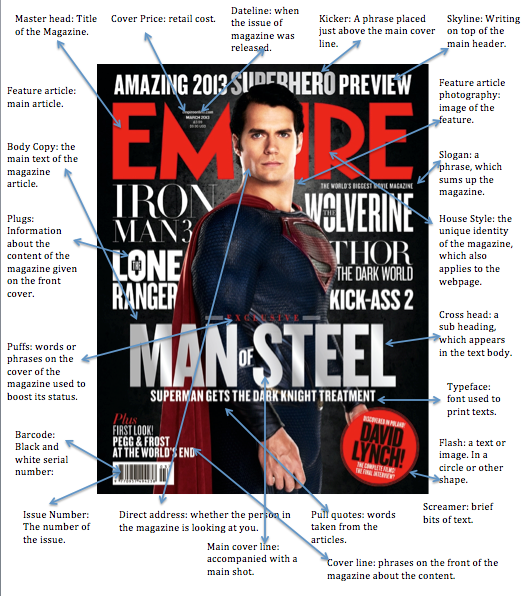
Things that are included in a magazine:
1. Plugs: Information about the content of a magazine given on the front cover.
2. Issue Number: The number of the issue.
3. Masterhead: The title of the magazine.
4. Cover price: retail cost.
5. Puffs: words or phrases on the cover .
6. Kicker: a phrase placed just above the main cover line on the front of the magazine.
7. Typeface: font used to print text.
8. House style: the unique identity of the magazine which makes it different from the other.
9. Barcode: black and white serial number.
10. Pull quotes: words taken from the article inside.
11. Main cover line: accompanies main cover shot.
12. Cover line: phrases on the front of the cover which give information on the content.
13. Skyline: Writing on the top of the cover above the masterhead.
14. Covermount: a free gift attached to the cover.
15. Strapline: Gives more information about the main headline.
16. Screamer: brief bits of the text to grab attention.
17. Slogan: a phrase which sums up the magazine.
18. Flash: a text or image in a circle on the front cover.
19. Dateline: date about when the magazine was issued.
20. Feature article: Main article
21. Feature article photograph: image relating to the feature.
22. Copy: the writing within the article.
23. Boxout: Square shape containing information.
24. Crosshead: a sub-heading which appears in the body of the text.
25. Direct address: whether the person is looking at you on the front of the magazine.
26. Drop caps: a large capital letter at the start of the paragraph.
27. Gutter: the strip of white space between each column.
28. Stand first: the first paragraph of an article, often printed in larger font.
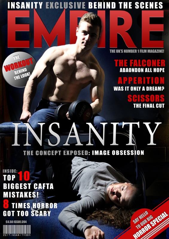
Our Magazine Cover
We have chose to do our magazine based on the Empire magazine as its the most up to date magazine. With its use of design and colours it will be really useful to present our magazine cover using this design. The other magazine cover we will also look at is SFX and Total Film as they are more recent magazine covers. The only problem with Fangoria is that its very out dated and won't be very useful for our target audience.