Editing Decisions
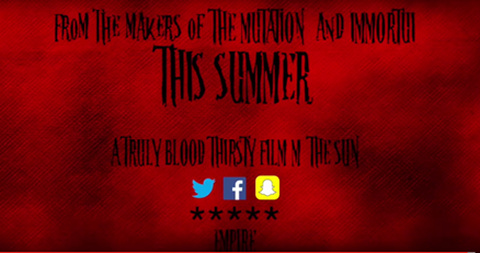
We decided when creating out titles to use a smoke effect and change the colour from blue to a red colour to make the image more sinister and show more of the horror theme in the titles. This added effect would have fitted in our trailer really well whether it was blue or red due to the overall colour scheme we chose for the trailer. We also looked at different editing techniques for our production logo. We looked at different font sizes but also the flashing animation behind it.
We also a used a transition effect throughout our trailer to insure a smooth transition between clips in the trailer due to the fast pace clips throughout to fit in with our music. This was needed so the shot did not pop in and out of the trailer. This transition ensure the audience that the trailer does not overall feel rushed.
In our last effect used in the trailer we added a different font an online website due to the editor having very basic fonts that did not appear to be scary enough for the trailer. We added the smoke effect in the background and added a red font to appear with the rest of the theme. Overall using a different font in comparison to the rest of the trailer made the end of the trailer stand out which is what we needed to do to ensure the trailer was successful.