
Examples of Distribution Companies and why they were successful.
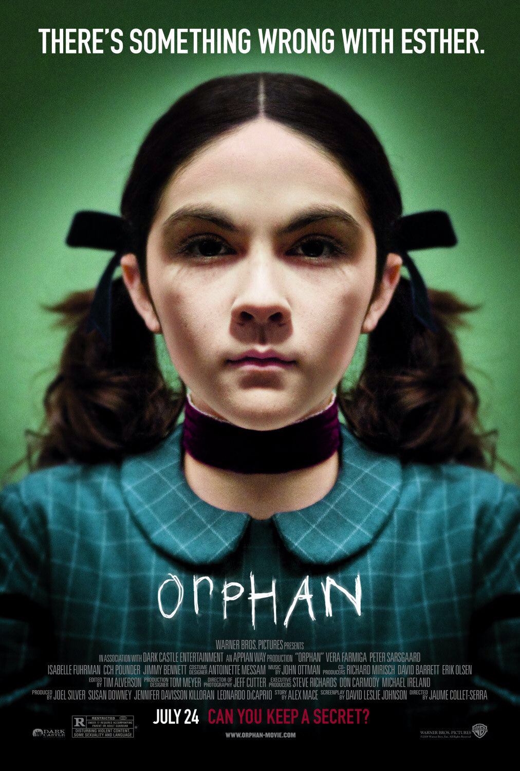
Warner Bro's inc. is an American entertainment company that produces and distubutes film. Films such as The Exorcist, The Shining, Friday the 13th and Orphan. The distribution logo is successful because it uses a picture through time which is on moving into the letters on screen. This represents that the company is trust worthy and has been producing for a very long time so all there films are successful . Which are seen by everyone. The gold colour represents wealth and happiness of people watching the film they are seeing before them. But the blue also represents feelings of sadness. These colours together almost represent that the films they create have happy and sad endings which will keep you watching.
|
|

|
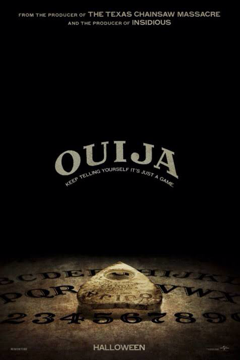
Universal Studios Inc. is an American film studio which produces and distributes films. The film studio is one of Hollywoods "Big Six" film studios. Films created by Universal Studies are Ouija , Worlds end and The Purge. The distribution logo is successful as it shows the Globe glowing and text of Universal Studios . It mainly focuses on this one part which makes the distribution very unique and eye catching. The distribution logo starts with what it looks like a sunset which eventually glows on the countries on the globe which could represent people watching the films on Television, Computer, Tablets or Cinema. The golden yellow used shows wealth and happiness. Which suggests everyone is happy when they are watching films by Universal. The symbolic use of the earth suggests that everyone is connect in the world while watching the films. We all watch the movie experience with Universal as a family.
|

|

|
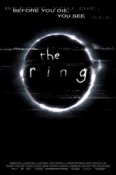
DreamWorks Studios also known as DreamWorks Pictures, is an American film production company who produces and develops films, television and video games. Horror movies are produced by DreamWorks e.g Fright Night, The Ring and The Uninvited. The distribution logo is successful as they use the reflection of moon and a man on it. Then it shows the person on the moon in the clouds. Clouds represent that DreamWorks goes above and beyond to make sure th audience will love there films. Reaching for skies and dreaming bigger to convince people to watch. It represents that the company is trustworthy and the best. The blue in the distribution logo represents that the film company is faithful and loyal.

|
|
|
Sony Pictures Entertainment Inc. is American film and television. They have developed and produced many films that you might know now, for example Resident Evil and Carrie. Starts with a bright light then the logo and name of distribution company appears. The logo is successful because the logo shows a bright light which almost looks like a star. The light almost goes in one direction across logo to represent that Sony pictures is pure and brand new. They are very trustworthy and faithful and will never let any of there customers down. The direction of the light represents that they are only going up and never letting there customers down.
|
|

|
Distribution On Our Trailer
We decided to use the Lionsgate distribution company do it fitting in well with a modern outlook for our trailer. We tried to look at more modern distribution company as we have decided to change the stereotype of horror. Lionsgate distribution was also perfect because it fit in well with our colour scheme created for our trailer which was red, black and white. The distribution logo colours uses a lot of black and white so it links really well to our overall trailer.
