
Font Choices and Justification
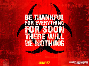
We liked in this film the way they have used the symbol in the background and red, white and black. It makes the audience wonder what will happen next as its very simple and doesn't give you much detail of the story line.
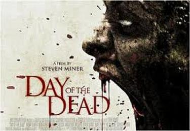
This movie shows the red, white and black colours but with a zombie face on the front. It mostly tells us that the film is about zombies. The use of the zombie stands out and makes you want to buy the film.
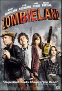
The use of the characters with weapons and red and orange. Tells you that these people are fighting for there life and its a very action packed film. It also tells you through the title colours that there will be a lot of blood throughout.
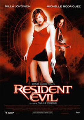
In this film the use of red, white and black with two women on the front. Appeals to male target audience but it also tells you that this film is going to be very action packed and gory through the colours of red and black. But it creates a mystery around these characters.
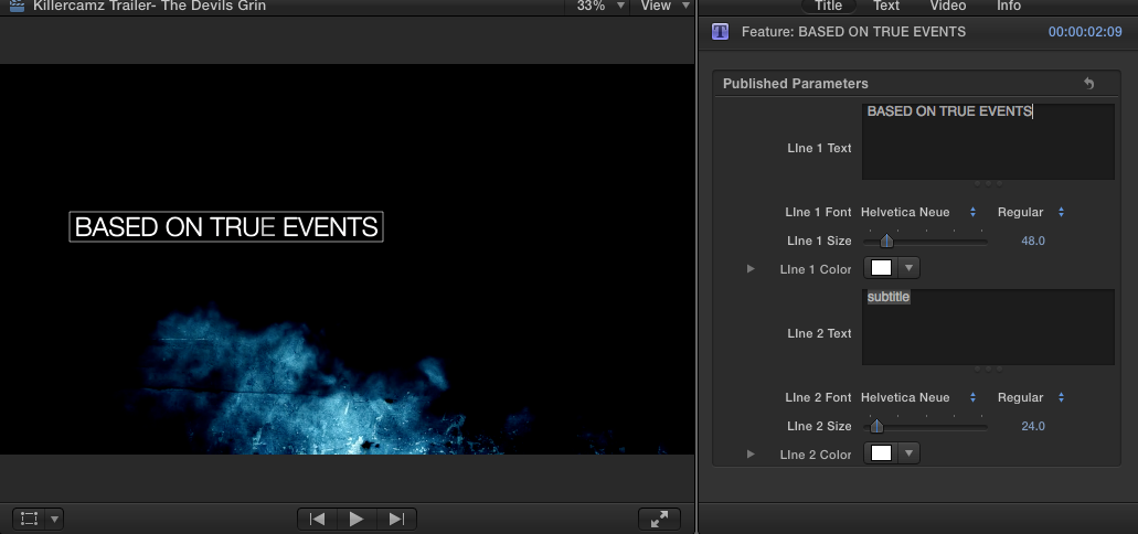
Our Titles
We decided to create out title using this font as the subtle style was similar to that of films such as the film "Get Out". we liked how the font looked as it presented quite a sinister atmosphere when it is placed upon a motion background. For our story based titles we decided to use the ominous bluish smokey motion background because it suited the same complimentary colour pallet that the text has. The use of the red and white blood stain texture for our main title also presents connotations of blood and gore which is in direct reference with the themes that we will be presenting throughout our trailer.
After seeing some of the titles from other films we decided to compile different elements from numerous films to create our own custom and yet effective titles.
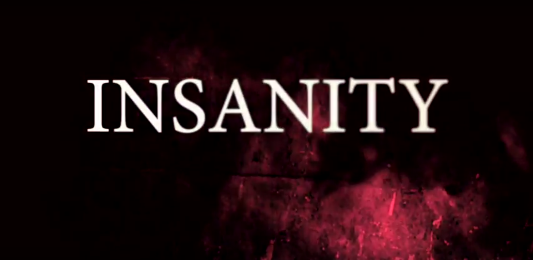
We have chosen to use a similar font for the title so that the titles over all are consistent with our style and dont change. If they had changed throughout then it would be confusing for the audience to link any particular font with our film as a memorable aspect. We have also decided to use the same smoke effect that is on the other titles tinted to appear red. This colour was chosen for its obviously dangerous connotations and how mysterious it looks. This mysterious and dangerous appearance is a lot like how we want the audience to perceive our killer which is essential for making sure people find the killer frightening.
